Posts

Showing posts from June, 2018

Interview

                                        Computers. Computers have been around for a while, and it seems with each year they are more and more versatile in what they can do. However, if you are a baby boomer, this may not be the case. You may see a computer as a foreign object. I interviewed my dad who has only had about three computers his whole life. He started with a computer in the nineties because he needed one for his business, he was a manager at a family run drug store. He used the computers to help keep track of bills and finances. Not anything else. I remember the first computer we got at our house. It just sat in the corner and did nothing. Sometimes we would play games on it, but most of the time it was just off. It was big box computer with only a black screen with green letters when you typed. He didn’t remember the brand, maybe Macintosh. He wasn’t sure. He didn’t s...
Motion Picture

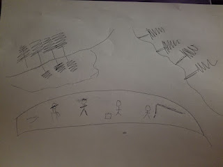
For this assignment I choose a Shel Silverstein poem I memorized when I was a kid. I love that it is silly and who doesn't love "Where the sidewalk ends. 20180624_230505.jpg 20180618_110909.mp4  " The video was a little different in that you have to make sure that you are moving with the speed of the person watching the video. Which just the storyboard they can follow along at their own pace.

Cartoon

Image
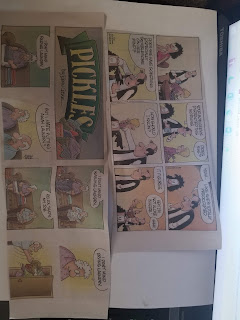
I choose these two comics because they suit my life. One being a mom, and the other my hate for the never-ending chore of laundry. I will wash it, fold it but I really, really hate it. With 5 people in a house it really gets exhausting. I know it sounds like the simplest one, but boy do I hate it. Plus, being the mom, it is my job and I really try to hand it off to the kids, but they just don’t do it the same

Typography and Graphic Design

What cues do you rely on to create the same message for two separate audiences? For kids, I used more shape than words and focused on color. For the older audience, it was more about words than visual context What invoked emotion? Really just figuring out your audience Was it easy to visually create the same message for two separate audiences? Yes and no. For the kids it really is not hard to be creative cause really anything can work, for Adults you want it to be visual enough to get attention but not distract from the message What surprised you? What did you find interesting? Appealing? This was much harder than I thought and was not as easy to be creative as you would think. Were there certain colors and fonts that consistently drew your eye? What did they have in common? Colors for kids are reds, blues, yellows bright and eye-catching

Visual Analysis

Image
Personal: He is a smug gentleman Historical: Debate with a potential of a first female candidate for president, and Donald Trump Technical: The fact that she is blurred in this picture lets you know that they want you to focus on his reaction rather than her. His sly smile in the background is the focus of this picture. Ethical: We all have the right to see what we want in this picture. The photographer that published this picture wants you to have a bias opinion of Trump and wants you to see him as the person in the photo. Cultural: Just like this picture out country was out of focus and jumbled at the time. We had no middle ground just his side or hers. Critical: This photo just tells me of his personality and what little class he has. That he has no fear of anyone and that he only really thinks of himself and holds himself in high regard. Personal: I love that she is engaging with the people. Historical: Debate between what could be the first woman president-elect and Donal...

Visual Persuasion

Image
For this assignment, I chose an ad from a People Magazine on May 21st, 2018. The ad is a Colgate ad depicting a man meeting his girlfriend's parents, specifically the father for the first time. I think that it's funny that we put so much emphasize and pressure on the man to meet the parents and gain the father's approval. I do think that this ad is spot on because we do tend to put so much emphasis on our outer image that we don't think that we can impress other than just or outward appearance.
Image
Combining two photos both of which represnet eating and what healthy eating can do for your body. We get out what we put in.

Visual Theoires

Image
I picked these photos because they represent the time spent with my family outdoors. We love being outdoors in the summer camping, fishing, and boating. Both these pictures represent both of those things. I love the scenery in both pictures and combining them they fit perfectly together.